Show more projects :
Yors
Designing a mobile app for a professional services marketplace
User Experience Design · Interface Design
The product owner came to me with a clear objective that he wanted to elevate the MVP version of their mobile app to be much more appealing and intuitive.
I worked closely with the product manager and developer for eight weeks to ensure the results that we want to achieve.
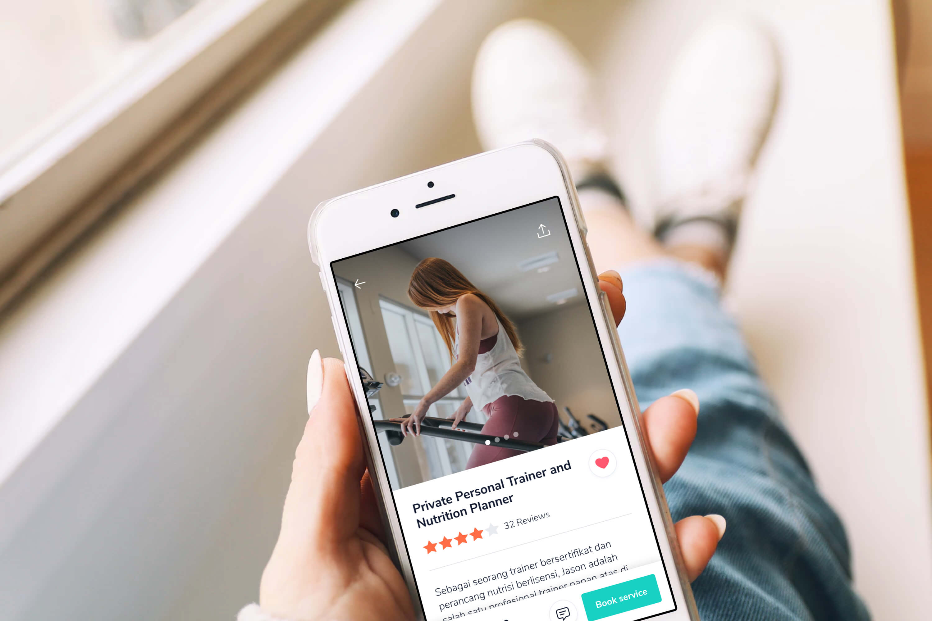
After conducting an evaluation, I defined a strategy that could be a quick improvement yet crucial to support the launching.
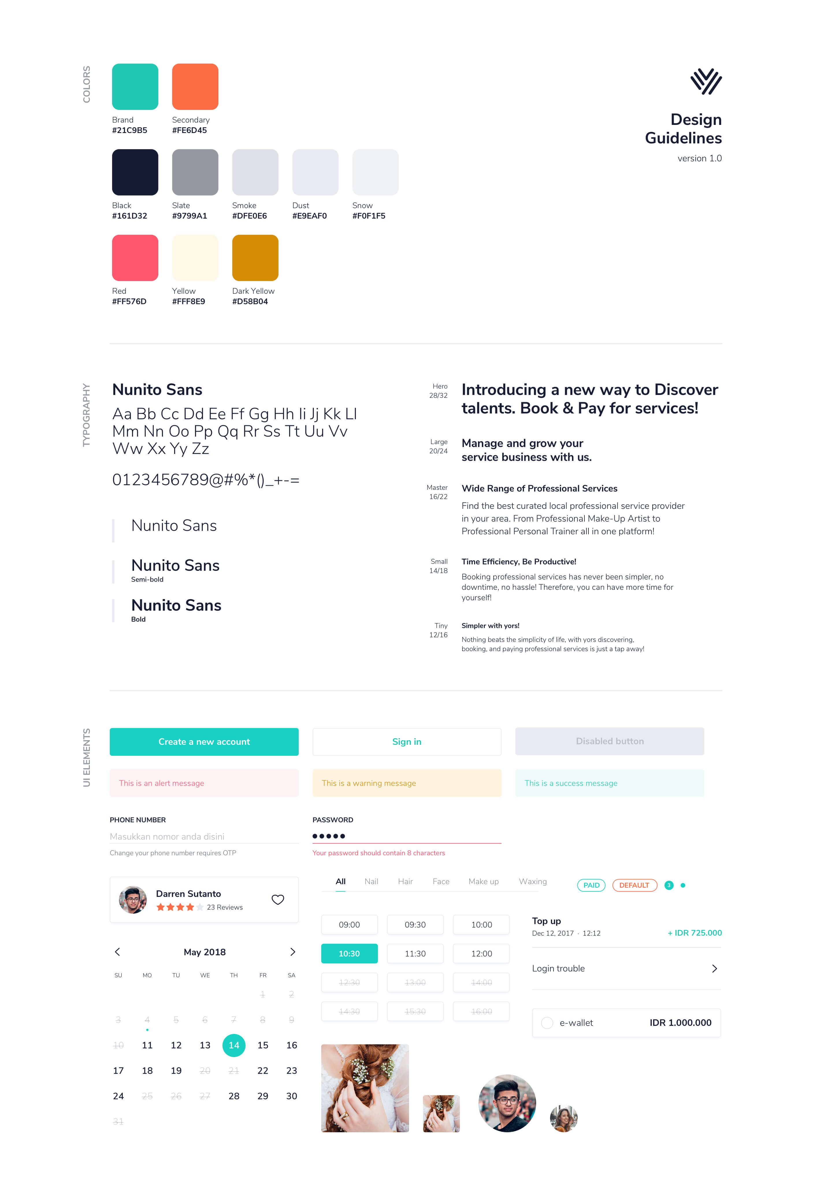
In addition to giving a more touch to aesthetics, I also suggested that we should build UI elements based on components. Each component needs to have a meaning and purpose of why such a component exists. Designing based on components would also bring the design output closer to the implementation as we wanted the result to be consistent and developed according to the design.
After we determined the visual direction, I continued by making a lean version of the style guide and implementing them to all the components. It was quite a back-and-forth for making sure the components are on point. I tested them on different screens and situations. Some feedback from developers also helped in creating the components even more robust.
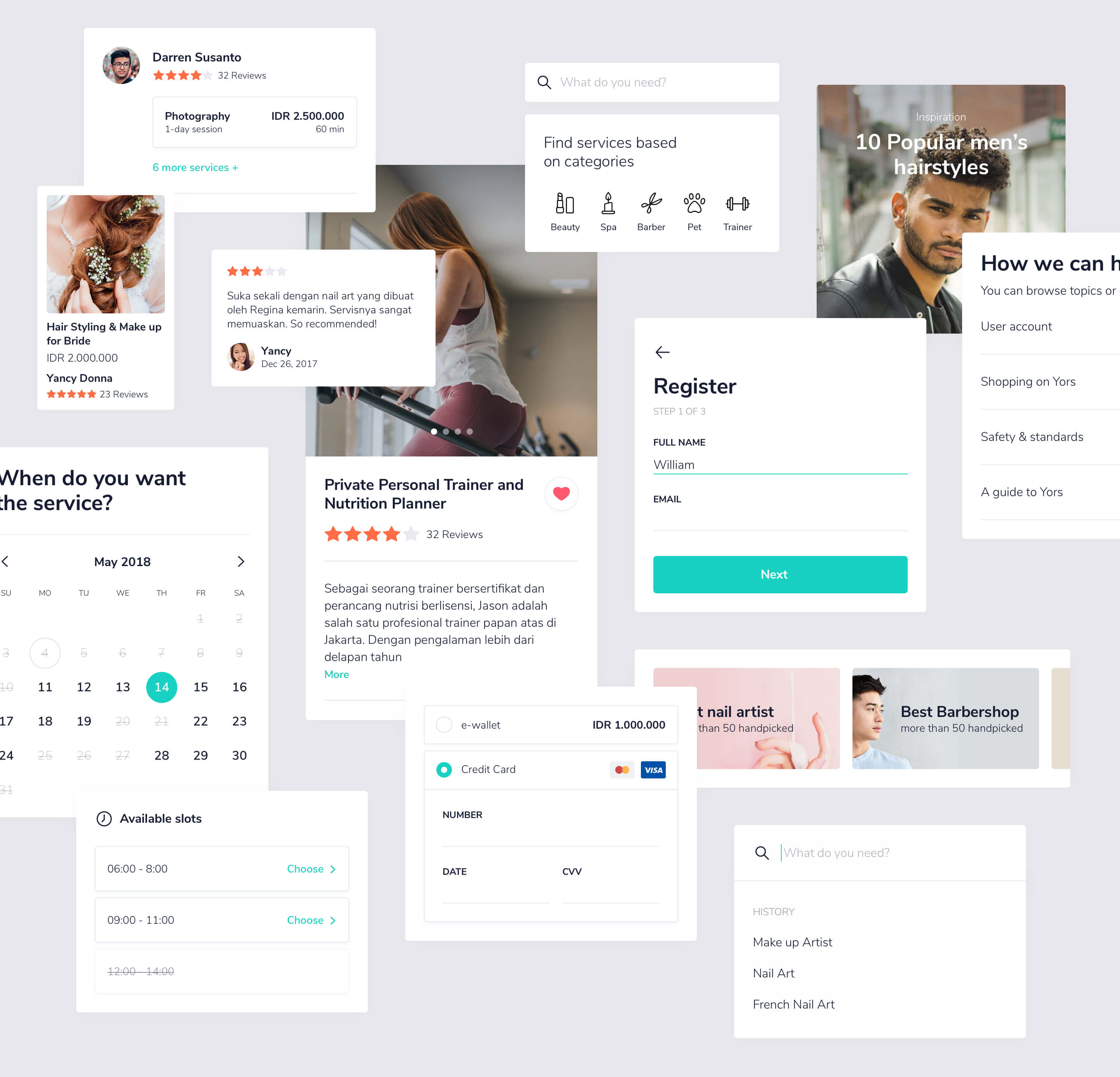
Rethinking the user journey to make it fluent and meet user needs.
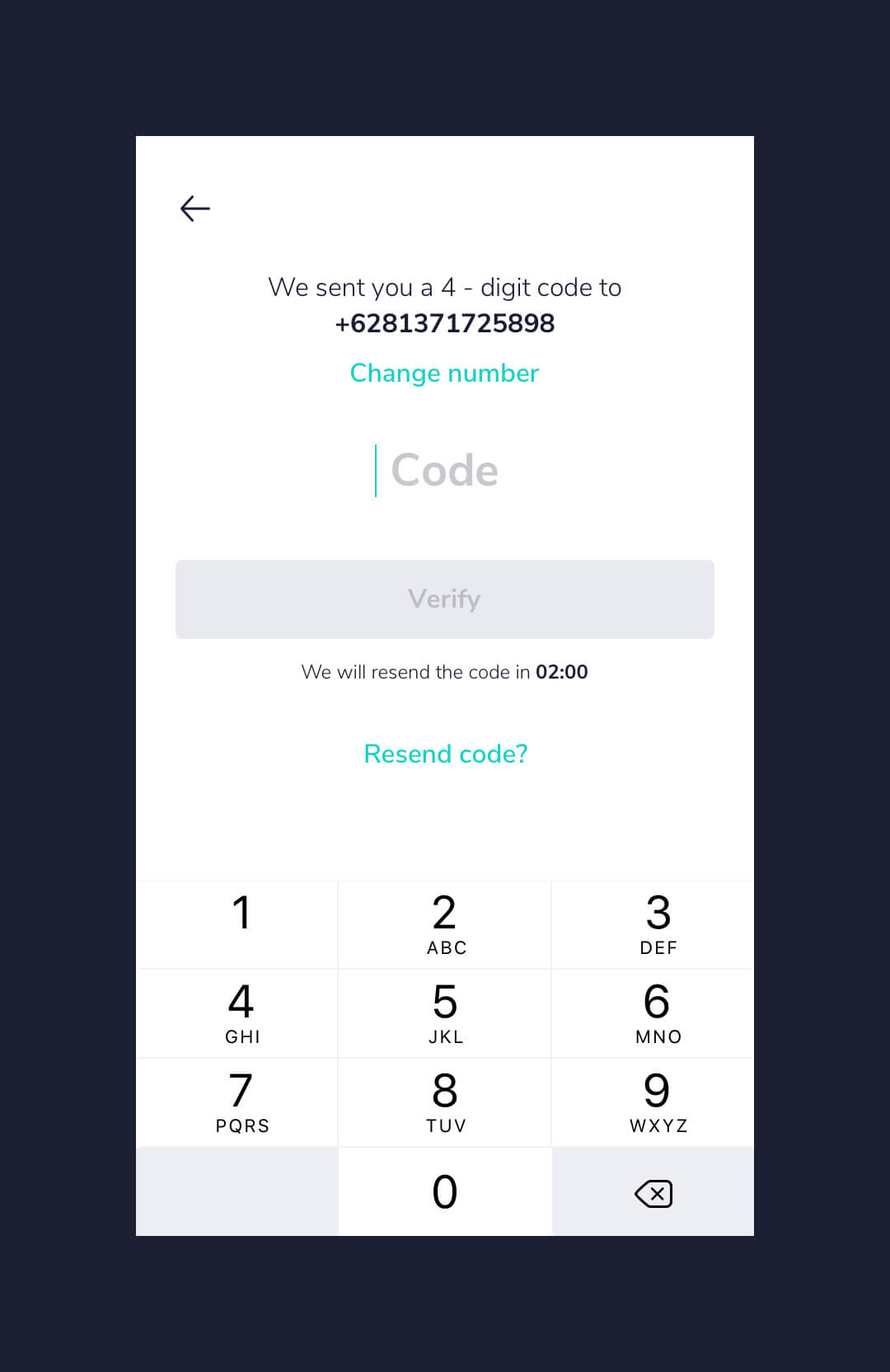
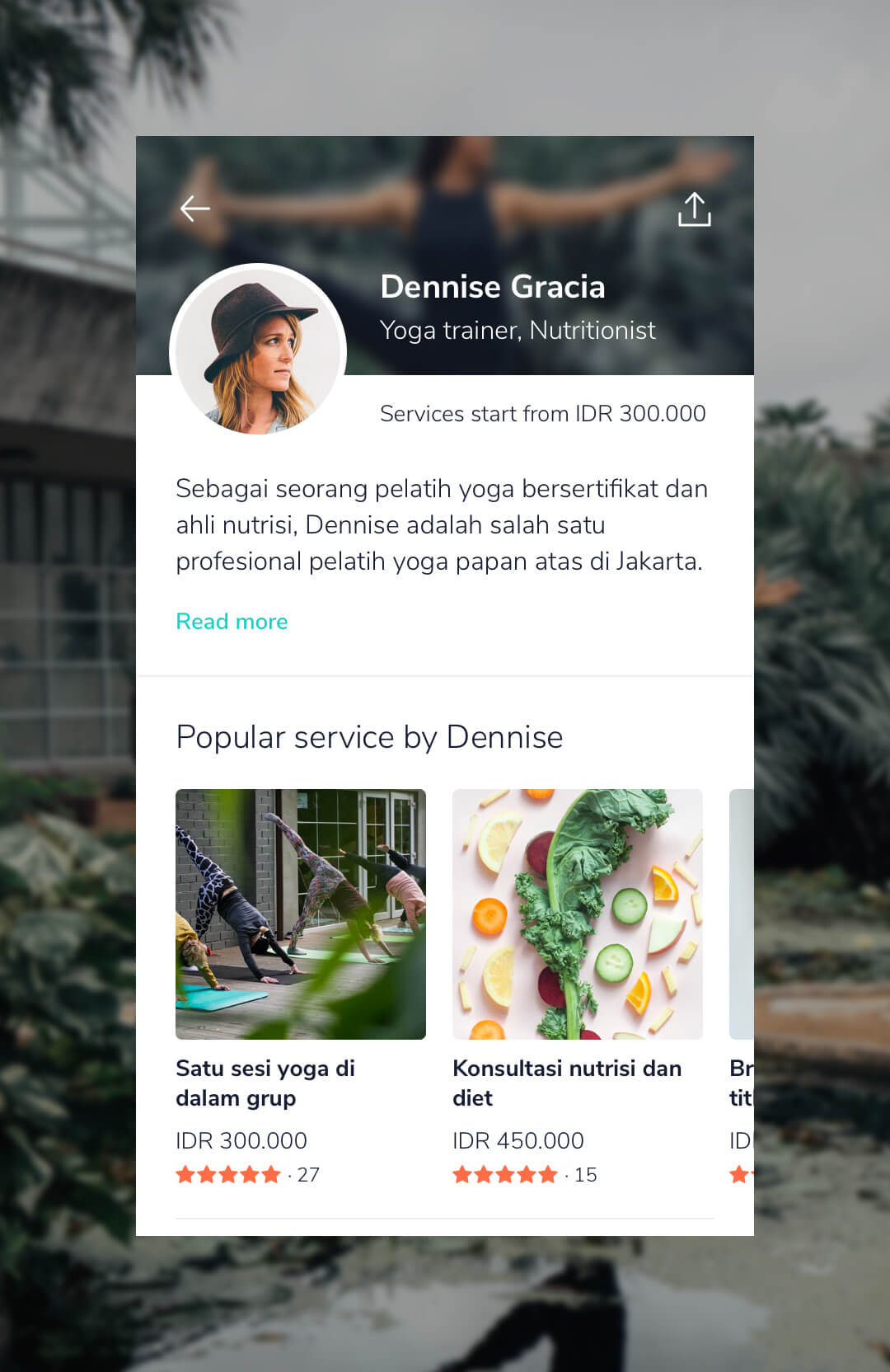
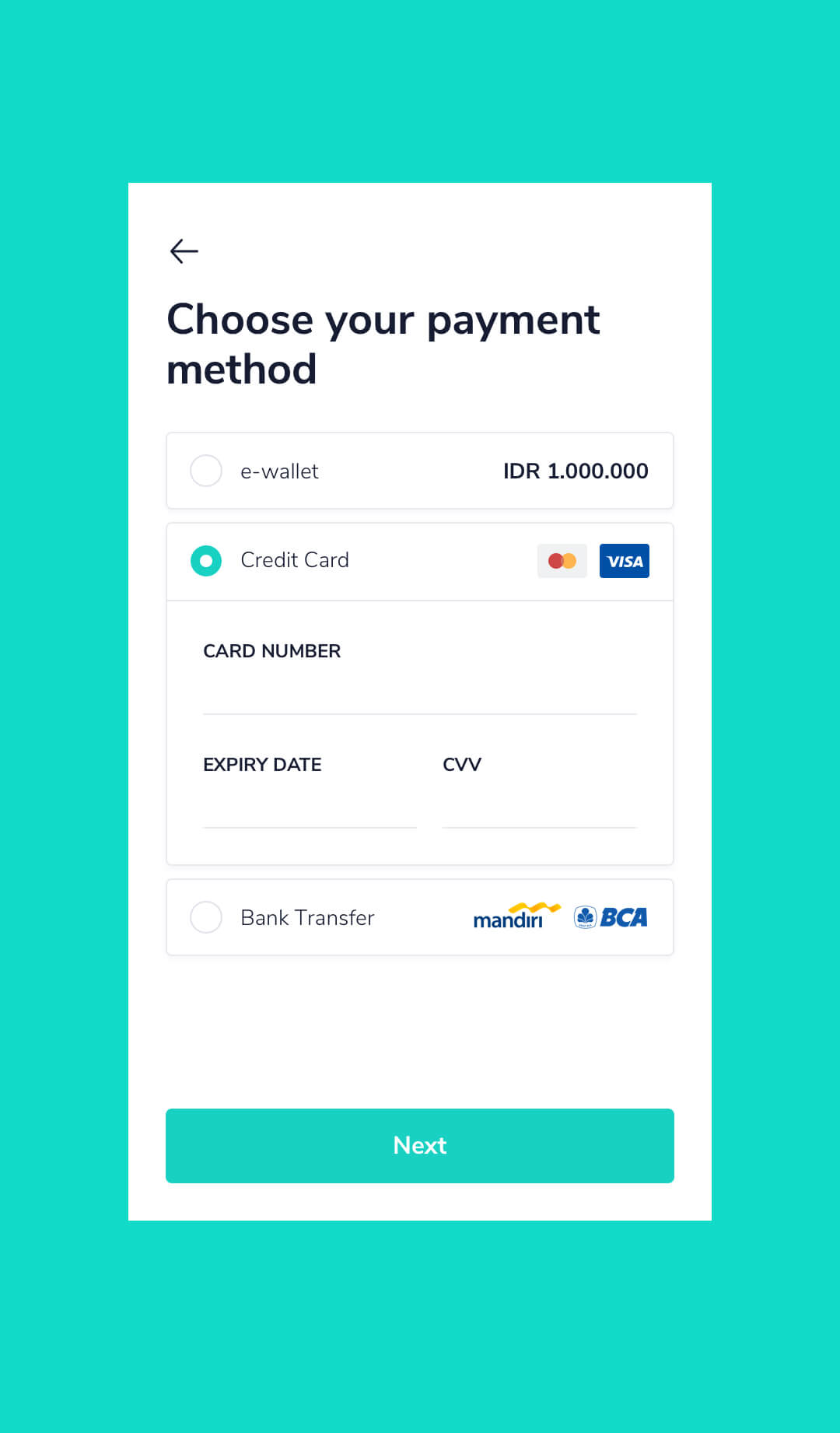
We strived to improve how users can find relevant services to be quick and easy. We also put our focus on making the experience on the profile and service detail screen seem real, warm, and trustworthy from service providers to their customers. Other than that, we brought in an interaction pattern, progressive disclosure, into practice to help us refine the checkout journey, so users don't feel overwhelmed and feel guided step by step finishing their order.
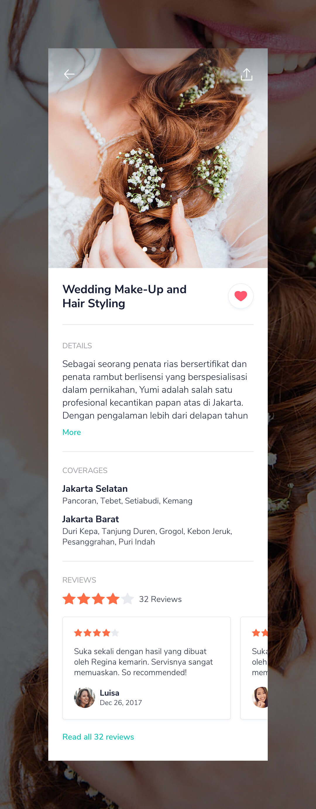
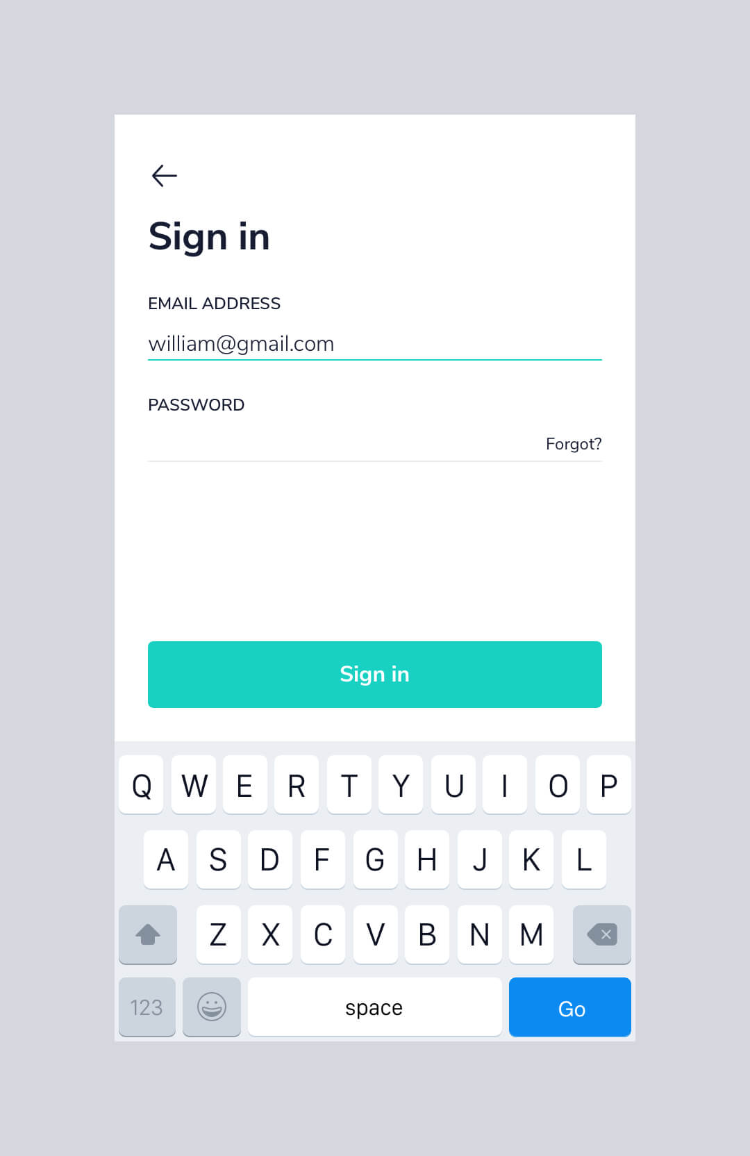
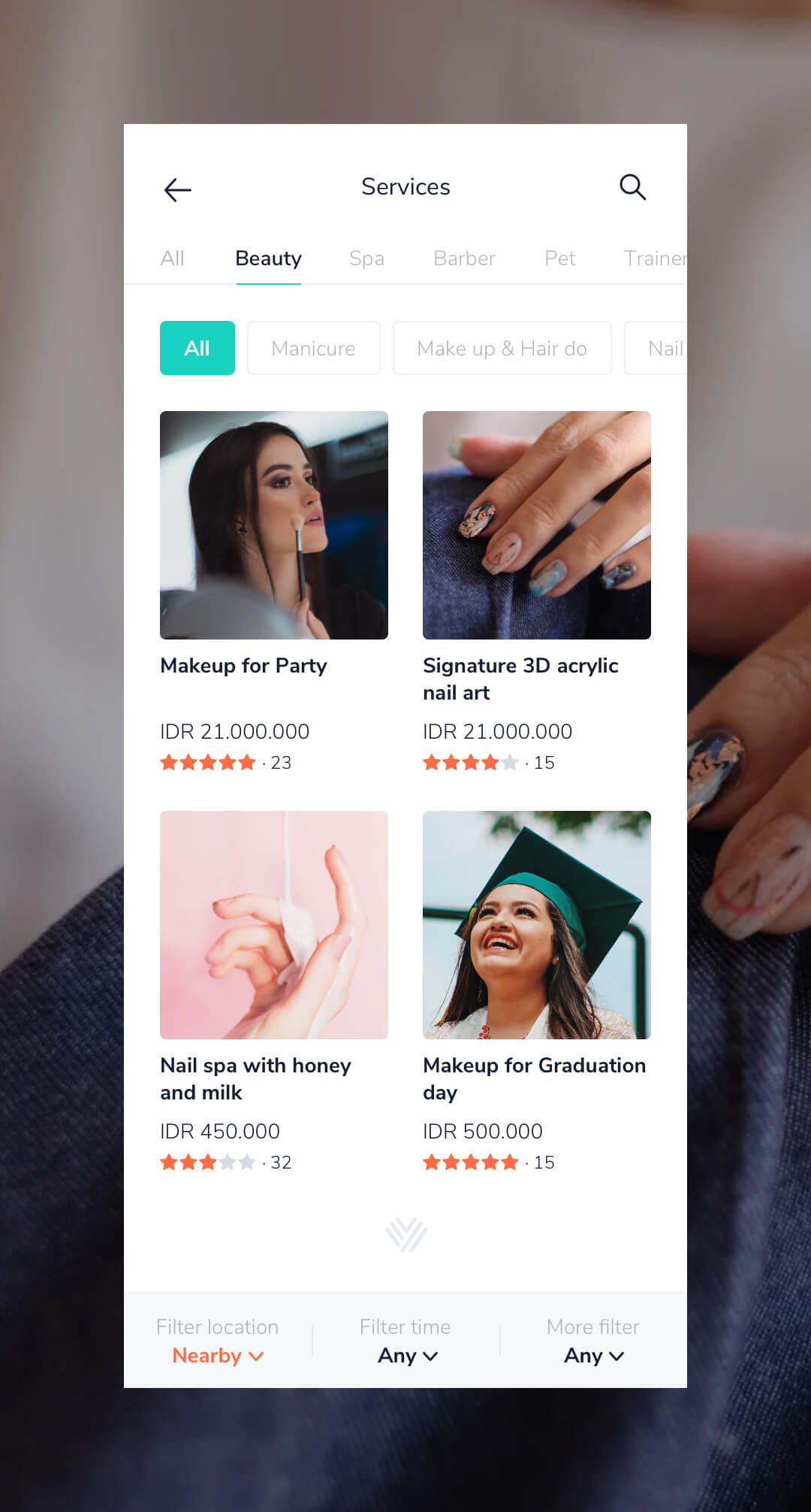
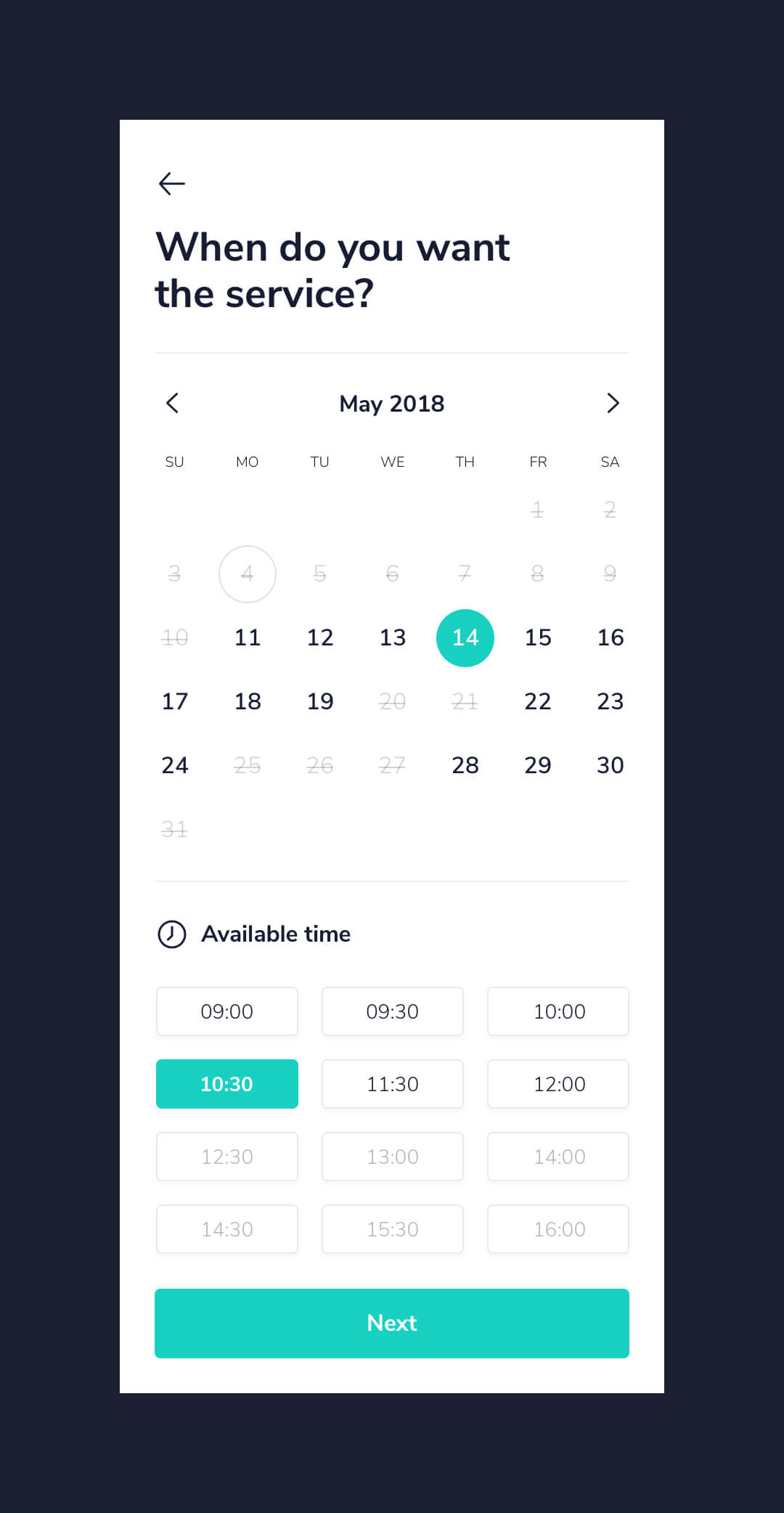
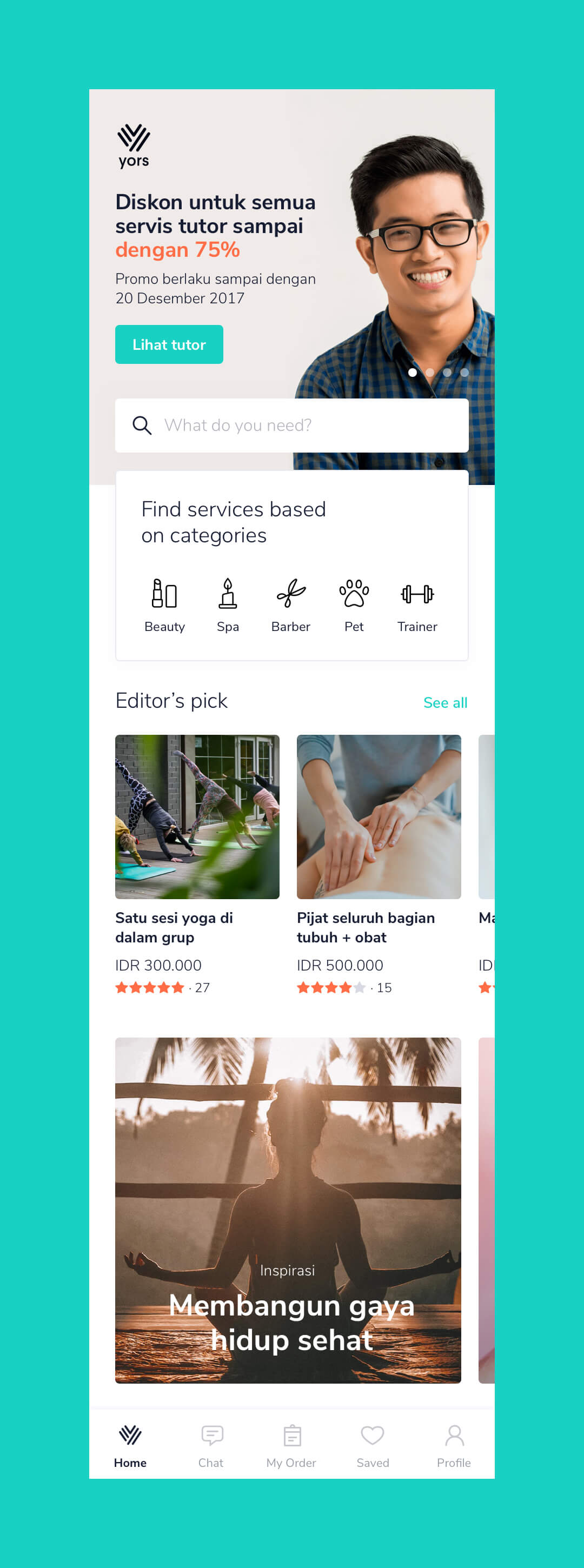
The result
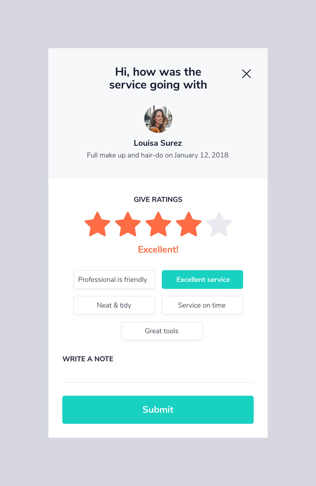
For eight weeks, the Yors team and I managed to make the user interface of the mobile app to be more attractive and intuitive. In general, the result boosted a sense of confidence for the owner and the team on releasing the app to the market.
Next
Email: hi[at]thebuddyman.com copied to clipboard

I enjoyed working with Thomas. His designs were sharp and the process is fast and efficient. Thomas is about quick execution, responsive communication and use of best practices. I recommend Thomas for web development.
Anatoly Alekseev
Managing Director of Black and Milk Residential Limited